
Earlier I compiled articles about the Four Treasures of the Study—Chinese brushes, ink, xuan paper, and inkstones. Some calligraphy enthusiasts asked me to also organize information about Chinese seals used in calligraphy works. To help everyone understand the basics of seal usage, I’ve collected and organized this article, which has been quite enlightening for me as well.
This article on Chinese calligraphy seals is divided into five parts:
- The purpose of calligraphy seals
- Common types of seals and their uses in calligraphy works
- Important considerations when applying seals to calligraphy works
- The use and maintenance of seal ink paste
- Basic knowledge about seal usage in hard-pen calligraphy
The content is primarily based on Li Jiong’s article “Knowledge of Seals in Calligraphy Works,” with some modifications and added images to help illustrate concepts mentioned in the text, making it easier for everyone to understand.
I. The Artistic Purpose of Seals
Seals are an essential component of calligraphy works. Without seals, a calligraphy piece is considered incomplete.

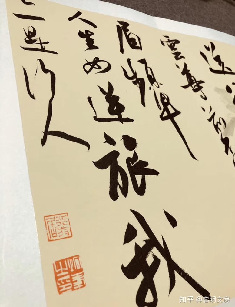
Example of a square calligraphy work by Lu Zhongnan titled “Cang Shen Yun Zhi” – I particularly admire this calligrapher’s work. Try to imagine the visual effect without the seals.
Seals originally served as credentials, functioning as proof of identity. After the Song and Yuan dynasties, as artists began to focus more on inscriptions and signatures in calligraphy and painting, they gradually recognized the artistic value of seals and started to utilize them in their works. This created the art form where calligraphy and seals complement each other. The interplay between calligraphy and seals not only enhances the artwork, creating a lively atmosphere and adding a “finishing touch,” but also helps adjust the visual center, compensate for layout deficiencies, and provides stability and balance to the composition.
Signing and sealing calligraphy works demonstrates sincerity and prevents forgery. Adding seals with elegant meanings can also express the calligrapher’s aspirations and sentiments. Therefore, calligraphers throughout history have placed great importance on seal usage—some even carve their own seals—to create an organic combination of calligraphy and seal art, producing a stronger and more beautiful artistic impact.
II. Common Types of Seals Used in Calligraphy Works
(A) Name Seals
Name seals are used for signatures. Names can be connected or separated. For signatures, using one character per name is considered proper, though using both surname and given name is also acceptable. When the signature includes the surname, a given name seal can be used; when there is no surname or no signature at all, a full name seal should be used to help identify the author.
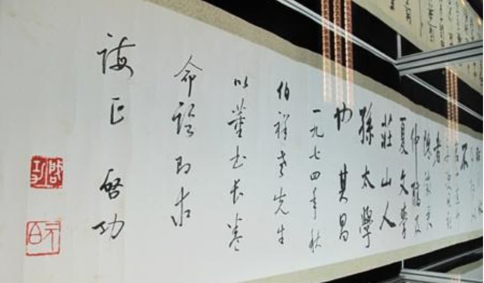
This is Master Qi Gong‘s (courtesy name Yuan Bai 元白) calligraphy work. You can see the master’s name seal and courtesy name seal.
In ancient times, seal usage followed strict etiquette: juniors writing to seniors would use name seals; peers would use courtesy name seals; seniors writing to juniors could use alternative name seals. Breaking these rules would invite ridicule. Modern calligrapher Zhang Daqian believed that “square shapes are best for name seals, round shapes are acceptable, but waist-round or natural shapes should not be used.”
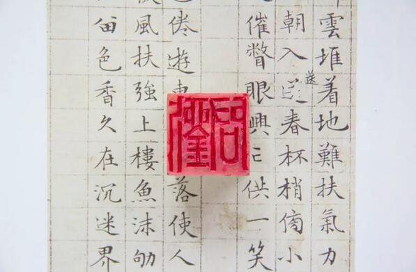
Name seals generally come in two types: red character (positive/yang) and white character (negative/yin). When using two name seals on one calligraphy work, it’s best to use one red and one white with appropriate sizes. When using multiple seals at the end of a signature, the order should be name seal first, followed by courtesy name or alternative name seals.

In this image, the upper seal shows yang text (red/positive 阳文), and the lower seal shows yin text (white/negative 阴文). Yang text means the characters stand out from the stone surface, while yin text is the opposite.
(B) Leisure Seals
Leisure seals, also called layout seals, include header seals, border seals, corner seals, and waist seals.
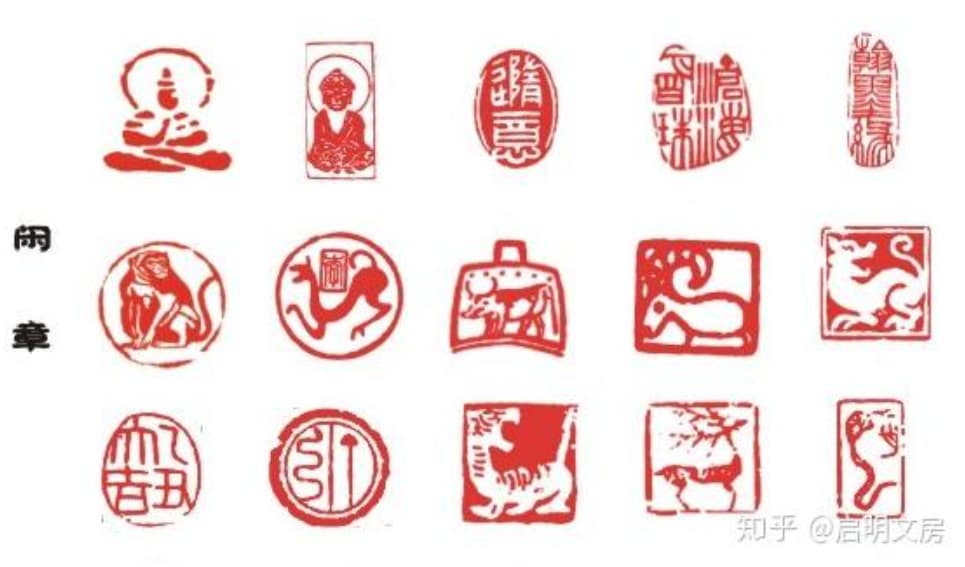
The seals shown in this image are all leisure seals
1. Header Seals
Header seals are placed in the upper right corner of calligraphy works, also known as “form-following seals.” These are carved according to the natural shape of the stone material and generally shouldn’t be square. Better shapes include half-regular, rectangular, circular, semi-circular, gourd-shaped, natural, or pictorial forms. Whether to use a header seal depends on the needs: if the beginning of the signature is too orderly and needs to be “broken,” if the seal at the signature end is too heavy and needs to be “lifted,” or if the seal distribution appears monotonous and needs “adjustment,” then consider using a header seal.

Master Qi Gong’s calligraphy work using a header seal
Header seals can be categorized by content as follows:
(1) Studio Name Seals: These reportedly began with Tang Dynasty Prime Minister Li Bi’s jade seal for his Duan Ju Shi. After the Song and Yuan dynasties, this practice became popular, with almost every calligrapher having a studio name seal. Ming Dynasty calligrapher Wen Zhengming said: “I often create my study rooms first on seals.” Studio names typically include terms like “zhai” (studio), “tang” (hall), “shi” (room), “lou” (tower), “ge” (pavilion), “guan” (building), “xuan” (veranda), “an” (hermitage), such as “Wei Qing Zhai,” “Xue Xi Tang,” “Mo Jian Shi,” etc.

Studio name seal – “San Shui Tang”
(2) Elegant Interest Seals: These are common auspicious phrase seals or quotation seals with deeper meanings. They may include philosophical sayings that inspire reflection, or record personal interests and sentiments. The content of elegant interest seals is wide-ranging:
- Some encourage learning, like “Zhuo” (carving), “Shi Fa” (learning methods), “Shu Chi” (book obsession), “Jing Yu Qin” (diligence), “Yi Wu Ya” (art is boundless), etc.
- Some express personal feelings, like “Shi De” (relying on virtue), “Ming Zhi” (clarifying aspirations), “Qing Qu” (pure interest), “Le Er Kang” (happy and healthy), etc.
- Some express sentiment about brush and ink, like “Po Mo” (splash ink), “Bi Geng” (brush cultivation), “Xiang Tian” (fragrant field), etc.
- Some wish for good fortune, like “Ru Yuan” (as wished 如愿), “Chang Le” (eternal joy 长乐), “Mei Bu Lao” (beauty never ages 美不老), etc.

Elegant interest seal – “Shi Gu Bu Ni” (Learn from the ancients but don’t be limited by them 师古不泥)
(3) Year Seals: Used to record when the calligraphy work was created, such as “Jia Zi,” “Yi Chou,” “Bing Yin” (traditional Chinese year names) or “1989,” “1990,” “80s,” “90s,” etc.

Year seal – “Geng Zi” year
(4) Month Seals: Used to record the month when the calligraphy work was created, such as “Shang Chun” (early spring), “Ru Yue” (like moon), “Can Yue” (silkworm month), etc.
2. Border Seals
Border seals are placed along one edge of the calligraphy work, serving to border and gather energy.
3. Corner Seals

Corner seals are placed at the corners of calligraphy works. Those in the upper right corner are called “greeting seals,” while those in the lower corners are called “pressing corner seals.” Unlike border seals that only control one edge, corner seals can control two edges, tightly fitting the corners to “border the edges,” “fill empty spaces,” and adjust and stabilize the visual plane.
4. Waist Seals
For long calligraphy works like vertical scrolls, if only a header seal is used in the upper right, the middle may appear too empty. A waist seal can be added, often featuring the calligrapher’s birthplace or zodiac animal. Waist seals should be smaller than header seals and signature name seals, and the three seals should never be placed in a straight line.

Waist seals are generally positioned in the middle of the work
All these “leisure” seals are not actually “leisurely” at all. When properly applied, they can serve both the purpose of brush and ink and beyond what brush and ink can achieve. As modern calligrapher and painter Pan Tianshou said: “Header seals and corner seals, like name seals, can create color variations and echoes, break monotony, and provide stability and balance to the composition.”
(C) Collector’s Seals
Collector’s seals are used by those who appreciate and collect works. Records suggest these also began in the Tang Dynasty and flourished after the Song Dynasty. Tang Emperor Taizong created a “Zhen Guan” (name of his reign period) linked-pearl seal, and Tang Emperor Xuanzong created a “Kai Yuan” linked-pearl seal, both used on imperial collections of calligraphy and painting. Later, collector seals had many names, such as “Collection,” “Treasure,” “Verification,” “Appreciation,” “Viewed,” etc. When applying collector’s seals, the size should be appropriate to the artwork, and care should be taken not to damage the character or image areas. Some collectors, hoping to achieve immortality, often damage artworks when applying seals—this should be avoided.

This image shows Huang Tingjian’s “Flower Fragrance Letter” with multiple collector’s seals

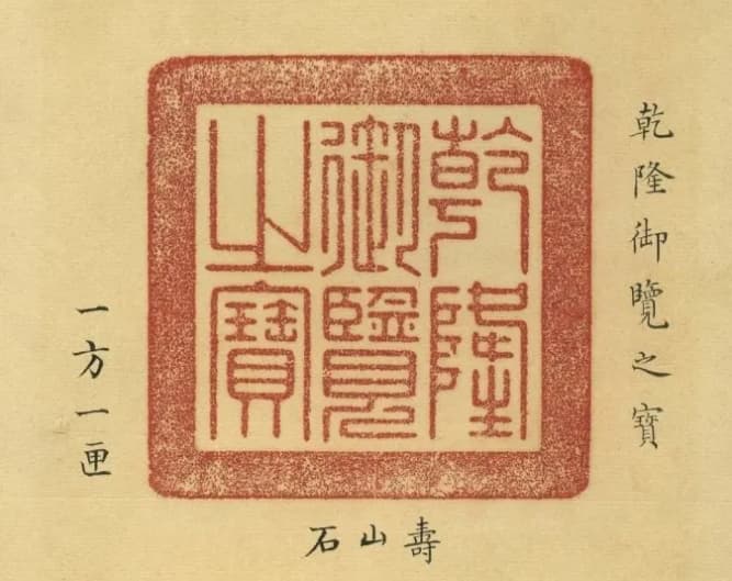
Collector’s seals from the Qianlong, Jiaqing, and Xuantong periods
III. What Should Be Noted When Applying Seals to Calligraphy Works?
Seals on calligraphy works are not applied randomly but follow certain principles. If improperly applied, rather than enhancing the work, they may ruin it and destroy the artistic effect of the entire piece. Therefore, how to apply seals requires serious consideration and careful deliberation. The following guidelines can usually be followed:
1. Appropriate Size
The size of seals should match the size of the calligraphy work and ideally be equal to the signature text. They can be slightly smaller but should not be larger than the signature text, as larger seals appear inelegant. If the signature text is small and the paper space is tight, small linked-pearl seals can be used, showing consideration. When using two seals of different sizes on one work, the upper should be smaller and the lower larger for stability, avoiding a top-heavy appearance. For collaborative works, seals from different contributors should be similar in size.
I particularly admire calligrapher Li Jiongfeng, who prefers small seals with characters several times larger than the seals
2. Minimal Quantity
Traditionally, odd numbers of seals were preferred: “Use one, not two; use three, not four; choose odd numbers, perhaps to support yang and suppress yin.” Seals should not be too numerous; too many create chaos and may overshadow the main work. If multiple seals are used on one work, different seal faces should be chosen to avoid similarity.
3. Appropriate Positioning
Seal placement requires careful consideration. Every artwork has areas of density and sparseness. Where density is insufficient, seals can supplement; where sparseness feels empty, seals can fill the space—like moving small “weights” to balance the composition. The position of name and courtesy name seals at the end of signatures must be meticulously arranged. If there is space below the signature, seals should be placed there; if not, left is better than right. Signature-end seals should maintain appropriate spacing—neither crowded nor scattered. When a work uses both header seals and corner seals, they should not be placed on the same side. Corner seals are best placed in the lower left corner, creating a diagonal arrangement with the header seal.
4. Balance of Weight
In terms of seal color, red character seals appear lighter, while white character seals appear heavier. For works with light ink, red character seals maintain harmony; for works with heavy ink, white character seals create a strong contrast between bright red and dark black, complementing each other. If multiple seals are used on one work, seal colors should have primary and secondary relationships—either mostly red with some white, or mostly white with some red—creating both variation and harmony.
5. Consistent Style
The style of seals should coordinate with the calligraphy style. For example, straightforward, quick-cut seals are unsuitable for neat and beautiful small regular script works; bold and energetic calligraphy works are unsuitable for delicate and refined iron-line seals—otherwise, they would clash and directly affect the artistic effect. When using leisure seals, attention should be paid not only to ensuring their content harmonizes with the main text, but also to maintaining consistency between the content and style of the seals. For instance, a “Motherland Mountains and Rivers” seal should not appear fragmented, and a “Great Hero of the Age” seal should not look thin and weak.
IV. The Use and Maintenance of Calligraphy Seal Ink Paste
An exquisite seal cannot fully display its spirit without fine, thick, and smooth seal ink paste, which would greatly diminish the effect. Generally, large characters often use burgundy seal ink, while small characters often use vermilion seal ink. Especially when stamping on black backgrounds in model calligraphy, vermilion seal ink must be used.

Vermilion seal ink paste for calligraphy
Since the Qing Dynasty, the red color has intensified, and ancient seal inks are often used to achieve an antique elegance with deep and heavy effects. Some connoisseurs stamp twice to enhance the thickness, ensuring perfect alignment, which can only be achieved using seal guides. For padding beneath the seal when stamping, rubber or other somewhat soft materials can be used, but not too soft as this can blur the seal impression. When stamping, I usually use a book, open to a few pages in, and then apply the seal. Some book covers might be too thick, making it difficult to press down, so turning to a few pages in before stamping works best!

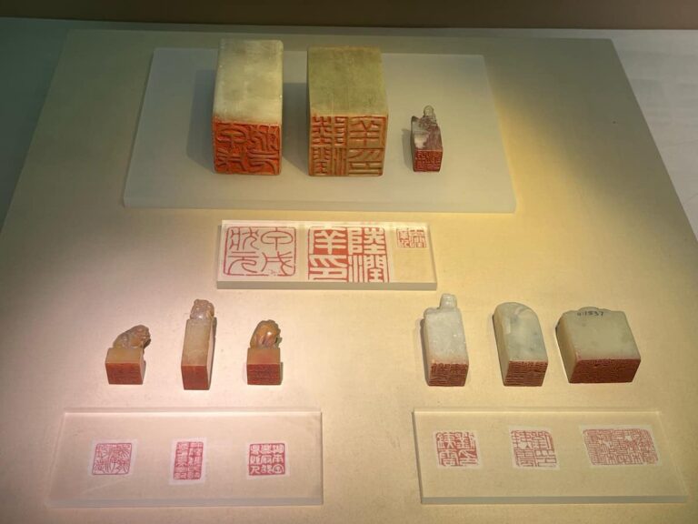
Display of my seal collection(Qi Ming 启明)
Seal ink paste is made from cinnabar, oil (typically castor oil), and artemisia fiber mixed together. Cinnabar is heavy and oil is light; if not mixed for a long time, they will separate, with cinnabar sinking and oil floating to the surface, sometimes even congealing and deteriorating, making it difficult to use. Therefore, every so often, you should use a bone paddle (generally called a bone slip, never use metal tools) to stir the seal ink, ensuring the three components mix evenly. When stirring, move in one direction, forming a ball, rather than back and forth.
Always keep seal ink clean. Before dipping the seal, wipe it clean; especially with newly made stone seals, be careful to remove stone dust from the carving to avoid contaminating the seal ink. When dipping, don’t press too hard or jab at the center of the ink; instead, follow the ink’s texture with a pushing and pulling motion, dipping several times to ensure the ink evenly coats the seal face. When stamping, hold the seal straight and press down with even force—don’t shake, tilt to one side, or press down on one corner—for the best results.
Additionally, if you’re interested in what kinds of stones are good for carving seals or would like to own your own seal someday, you can read “What Stones Are Good for Carving Seals (Six Types of Stones Suitable for Calligraphy and Seal Carving).”
For information about seal ink paste, you can read: “My Study Collection: Types of Seal Ink (Comprehensive Guide with Images)”
V. How Are Seals Used in Hard-Pen Calligraphy?
Traditional brush calligraphy has developed a complete set of rules and patterns for seal usage over time, with calligraphy and seals harmoniously united—seals have become an indispensable part of traditional calligraphy.
So how should seals be used in hard-pen calligraphy, which developed from traditional foundations?
First, we need to understand the purpose of seals. The general aims of using seals in calligraphy works are:
(1) To enrich the visual plane and balance the composition (2) To supplement and enrich the signature content (3) To showcase the artistic charm of the seal itself (4) To facilitate appreciation and collection
Due to differences in writing tools (pen and paper) between hard-pen calligraphy and traditional Chinese calligraphy, the two forms differ in appearance. Since hard-pen calligraphy uses smaller characters and generally ordinary white paper, seal usage in hard-pen calligraphy has its own unique characteristics:
1. Seal Style
Hard-pen calligraphy lines are predominantly “thin and hard,” so seals with strong, thin, and hard styles are suitable. For hard-pen regular script, seals with orderly text are appropriate; for running and cursive scripts, seals with bold text are suitable; for clerical and seal scripts, seals with ancient-style text are appropriate.
2. Seal Size and Quantity
Since hard-pen calligraphy uses small paper and small characters, the seals should be small rather than large, generally 8-10mm is sufficient. Oversized seals are a common problem in many hard-pen calligraphy works today. Similarly, the number of seals on one work should be fewer rather than more, usually just one, maximum two (when using two seals, one red and one white is best). Of course, artists should have several seals of different styles to choose from.
3. Seal Text Character Count and Content
Hard-pen calligraphy seals are relatively small, so the seal text should have fewer characters rather than more (generally just one character is sufficient), and be simple rather than complex. For seal content, usually just the author’s “surname” is enough. Some authors only sign their given name without their surname, and their seals also only show their “given name” (no surname), creating repetition and failing to completely represent the author’s full name. It would be better to sign with the given name and then stamp a one-character “surname” seal, thus including both name and surname, character and seal, complementing each other perfectly.
4. Header Seals
Due to character size limitations, hard-pen calligraphy generally doesn’t require header seals.
Additionally, traditional calligraphy uses xuan paper, and after stamping and mounting, it can be preserved for a long time. Hard-pen calligraphy often uses ordinary white paper, and after stamping, the seal ink sits on the paper surface; without proper care, it easily becomes damaged. Therefore, hard-pen calligraphy should use fewer seals. Especially when there is no space left after the signature, forcing a seal should be avoided. Seal ink should also be carefully selected. Particularly noteworthy is that “seals” carved in computer fonts at engraving shops often lack artistic value and clash with calligraphy works—they are best avoided.
In summary, seal usage in hard-pen calligraphy should be minimal and small. Choose seal styles based on the work’s style and use seals according to the layout needs—use when necessary, not forcibly. Appropriate seal usage can enhance the work, while inappropriate usage can only destroy its artistic value.
Afterword
Above is knowledge related to seals in calligraphy works. For studio tools, you can also read:
Top 10 Chinese Calligraphy Brushes: The Ultimate Guide to Selection and Care
Top 10 Chinese Xuan Paper Brands: Selection Guide & Care Tips
The 5 Best Chinese Ink Brands: Properties, Selection Criteria & Care Guide
I believe these articles will give you a more detailed and systematic understanding of writing tools like brushes, ink, paper, and inkstones.
If you found this article helpful, please save it!
I love your blog.. very nice colors & theme. Did you make this website yourself or did you hire someone to do it for you? Plz answer back as I’m looking to create my own blog and would like to know where u got this from. appreciate it
谢谢您,这是我自己做的,用的wordpress
Great line up. We will be linking to this great article on our site. Keep up the good writing.
Thank you, could you tell me your website? Is your website also about Chinese calligraphy?