When learning any style of Chinese calligraphy, the first step is to get a clear, overall picture of its characteristics. Seal script (篆书, Zhuàn Shū) is one of the most beginner-friendly calligraphy styles out there. So what exactly makes it special? In this article, Qi Ming Wen Fang breaks it all down — covering the major artistic features, structural traits, brushwork techniques, and radical (偏旁) characteristics of seal script.
Part One: The Major Artistic Features of Seal Script
1. Rooted in Nature: Every Character Tells a Story
Seal script is the earliest form of pictographic writing, and it carries the fingerprints of our ancestors who looked at the natural world and turned what they saw into symbols.
By quietly observing nature and mimicking the shapes of things around them, ancient people created these visual characters. As a result, both Large Seal Script (大篆, Dà Zhuàn) and Small Seal Script (小篆, Xiǎo Zhuàn) are packed with pictographic elements.
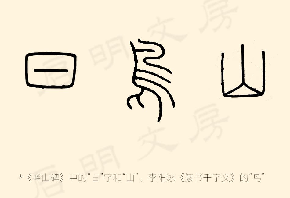
For example, the character “日” (sun) looks like a circle with a horizontal line through the middle — a simple but clear image of the sun. The character “鸟” (bird) sketches out a bird’s head, body, wings, and claws. And “山” (mountain) looks just like a row of mountain peaks lined up together.
Even as writing evolved into Small Seal Script and the strokes became more standardized and symbolic, the core idea — that characters grow out of the shapes of real things — remained clearly visible.
2. Balanced Structure, Smooth and Rounded Strokes
Small Seal Script places a very strong emphasis on symmetry and order. Strokes are horizontal and vertical, with consistent line thickness throughout, giving the writing a clean, highly organized beauty.
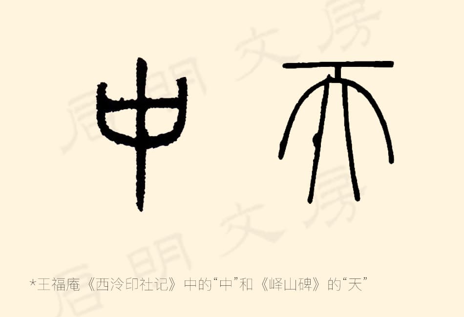
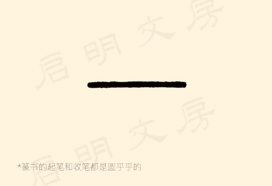
Both the beginning and ending of each stroke are rounded — there are no sharp, angled cuts as you’d see in other calligraphy styles, and the brush tip is always kept hidden (no exposed points). Because the central vertical axis of each character tends to be stretched longer, most characters fit neatly into a tall, vertical rectangle — think of characters like “中” (middle) and “天” (sky).
In other styles like regular script (楷书, Kǎi Shū) and clerical script (隶书, Lì Shū), corners tend to be sharp and angular. But in Small Seal Script, those corners are almost always replaced with smooth, rounded curves.
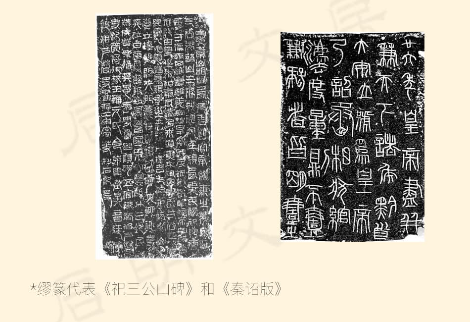
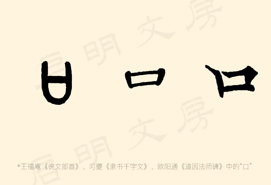
It’s worth noting that in certain specialized forms — like Miù Zhuàn (缪篆, used for engraving seals) or some Qin Dynasty imperial decree tablets (秦诏版) — you can occasionally spot some angular strokes. But even there, if you look closely, there’s still a roundness hiding within those angles. This is very different from clerical script, which uses purely square, sharp corners. A perfect example: the four corners of the character “口” (mouth) — in seal script, they are curved arcs, in clerical script, the corners start to become more defined, and in regular script, they are sharp and clear-cut.
3. Hidden Brush Tips — No Sharp Flicks or Sweeping Tails
The visual language of seal script is beautifully simple. Every stroke within a character is roughly the same thickness, and all strokes basically come down to just three types: dots, straight lines, and arcs.
Because the brush tip is always kept tucked in (a technique called “hidden tip” or 藏锋, Cáng Fēng), there are no sharp leftward flicks (撇, piě) and no rightward sweeping tails (捺, nà) as you’d find in regular or clerical script. Every stroke and every radical wraps up neatly within rounded, arc-shaped lines.
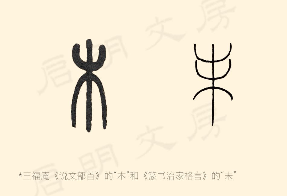
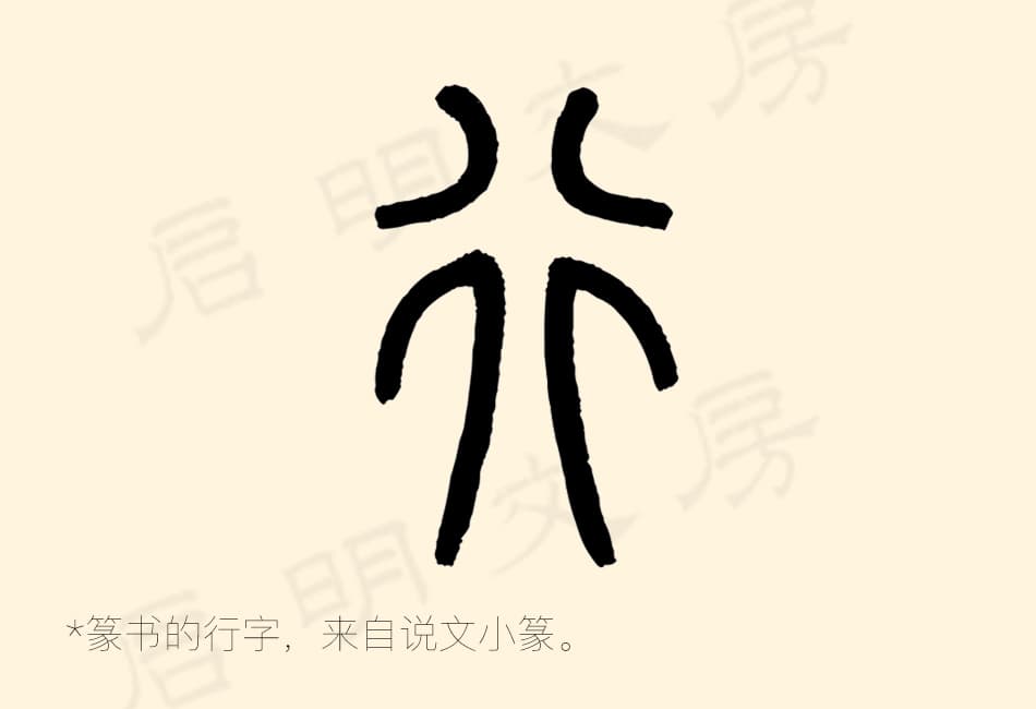
Take the character “木” (tree), for example — its left and right “branches” spread out in matching, symmetrical arcs. Or the character “未,” where every stroke connects through smooth curves, with absolutely no sharp points sticking out anywhere.
4. Uniform Size — Every Character Gets Equal Space
Seal script pursues a perfect balance both in overall layout and in individual characters. In classic seal script stele and model calligraphy books (碑帖, Bēi Tiè), no matter how simple or complex a character is, every single character takes up roughly the same amount of space on the page.
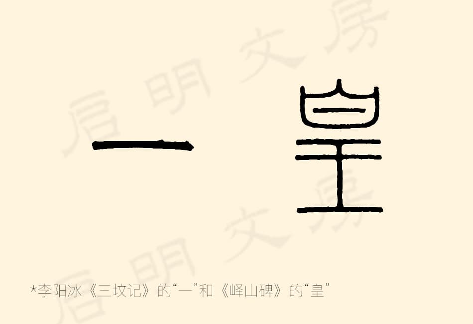
A simple character like “一” (one, a single horizontal stroke) and a complex character like “皇” (emperor, with many strokes) occupy almost the same amount of visual space — the same black-and-white balance within their grid box.
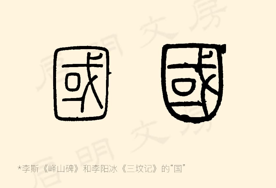
Another good example is the character “国” (country/nation). Whether written in the Qin Dynasty style or the Qing Dynasty style, the outer frame and inner components always maintain well-proportioned, consistent ratios.
5. Slow to Write — and That’s Why It Evolved
Because of all these careful structural rules and exacting brushwork requirements, seal script is very slow to write. It’s not efficient for everyday use.
As paperwork and administrative writing increased during the Han Dynasty, scribes needed a faster option. This need gradually gave birth to clerical script (隶书) and other more efficient writing styles.
Part Two: Structural Characteristics of Seal Script
1. Symmetry with Variation in Length
Small Seal Script is deeply committed to symmetry — left-right symmetry, top-bottom symmetry, and even the angles of curved strokes on both sides mirror each other. Paired strokes on either side create a sense of balance.
However, the single stroke placed in the center of a character is often made longer or shorter to visually balance the two sides. Take the character “行” (walk/travel) — it’s symmetrical on both sides, while the central stroke adjusts its length to complement them.
2. Balance with Deliberate Variation
While seal script strokes are evenly spaced and well-distributed, writers intentionally add subtle variation to avoid looking too mechanical or rigid.
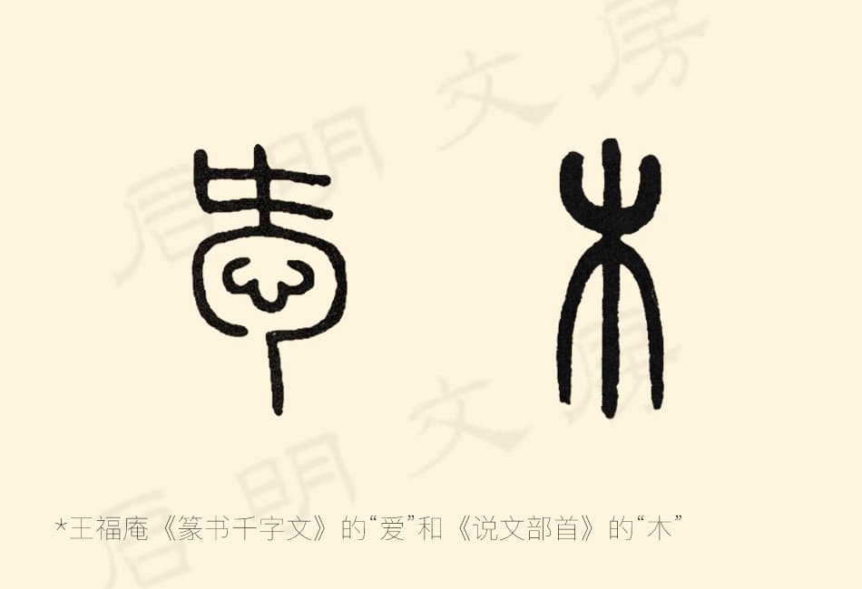
When two strokes mirror each other on either side, the lower-right stroke is sometimes made slightly longer or given a small curve — as seen in the character “爱” (love). When the same stroke type is stacked on top of each other, the upper one is written slightly smaller and the lower one slightly larger, creating a pleasing visual variation — as in “木” (tree).
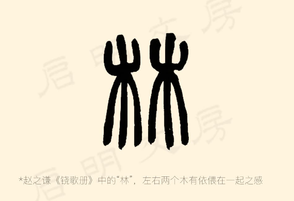
Similarly, in the character “林” (forest — two “木” side by side), the left and right halves are not perfectly identical; there are subtle differences between them.
3. Compensating for Imbalance
Seal script characters are designed to look beautiful and well-proportioned — and in some ways, they still carry a painterly quality. Achieving this requires a thoughtful arrangement of the overall structure.
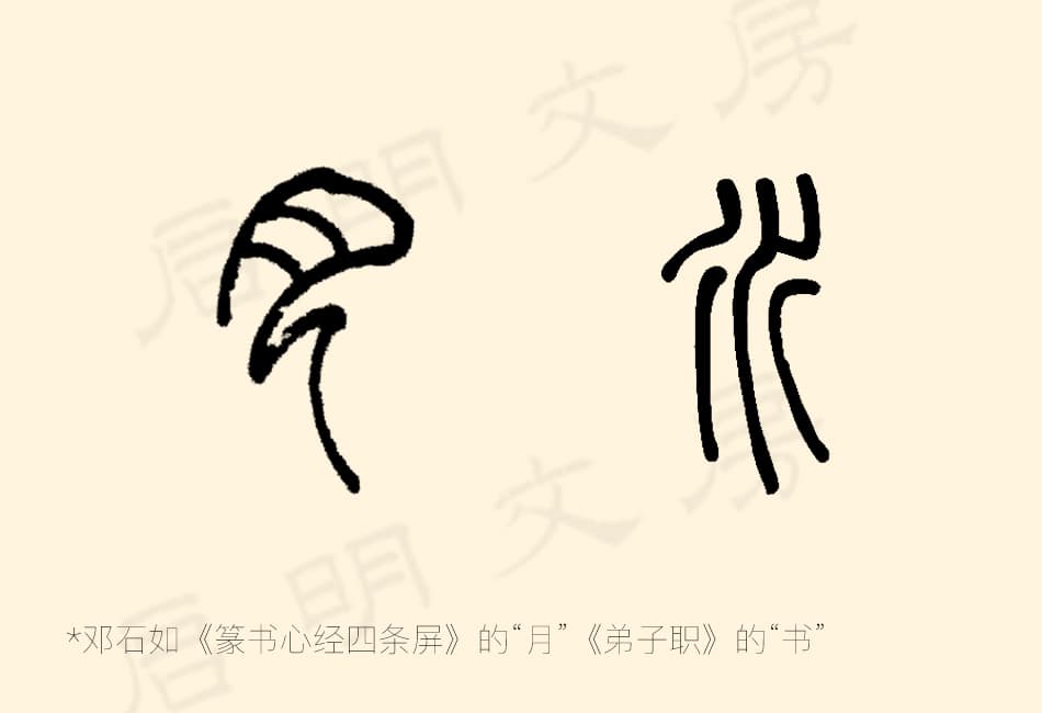
For characters that are structurally very simple, a skilled calligrapher can add variation to the strokes (without breaking the rules of the character’s structure) to add visual interest and beauty. Good examples are the characters “月” (moon) and “水” (water).
Part Three: Brushwork Techniques in Seal Script
1. Center Brush, Round Start and Finish
The brush is always held and moved so that the tip stays in the very center of the stroke (中锋, Zhōng Fēng). Both the beginning and the end of every stroke are rounded.
图片 Among seal script, clerical script, and regular script, only seal script uses a fully rounded start and finish
2. Lifted Brush, Consistent Thickness
The brush is kept slightly lifted during movement, which is what allows the stroke thickness to stay even and consistent throughout.
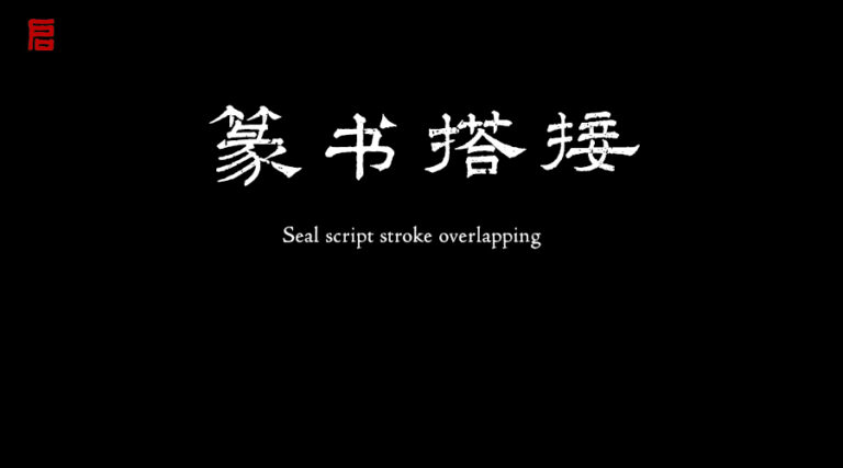
3. Smooth Arc Strokes — No Visible Joints
When writing arc strokes, the motion should be smooth and fluid. Where two strokes meet and connect, the joint should be completely invisible — seamless.
(Interested readers are welcome to check out Qi Ming’s previously published article: “Connecting Strokes in Seal Script — A Must-Read for Seal Script Enthusiasts”)
Part Four: Radical Characteristics in Seal Script
The radicals (偏旁, Piān Páng) used in seal script are not fully standardized — the same radical can be written in different ways, and its position within a character can shift: it may appear on the left, the right, or at the bottom. Here are some common examples:
1. Left-Side Radicals
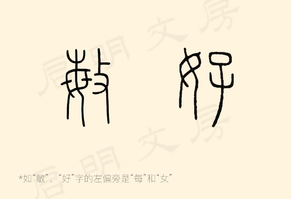
While the specific forms differ between Large and Small Seal Script, left-side radicals always lean slightly toward the right to visually connect with the main part of the character. They should also be able to stand alone as independent characters.
The amount of space a left-side radical takes up depends on the width of the character component to its right. Interestingly, left-side radicals can sometimes be moved to the right side — as seen in the characters “敏” and “好.”
2. Right-Side Radicals
When writing, the left-side radical comes first, followed by the right. Right-side radicals should visually “glance” back toward the left, creating a sense of connection. Pay attention to how the parts interlock, and make sure the length adjustments between components feel natural and balanced.
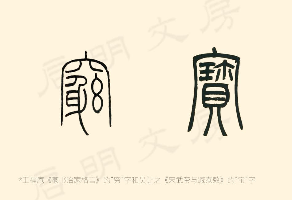
3. Top Radicals (Character Caps)
Top radicals should visually cover and shelter everything below them. For example, in radicals like “穴” and “宀,” the left vertical stroke and right hook are extended outward, creating two long strokes that lean slightly outward. This forms a three-sided enclosing frame that wraps tightly over the lower portion of the character.
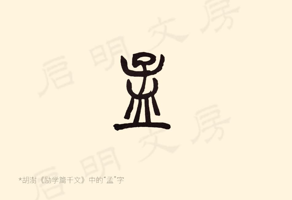
4. Bottom Radicals (Character Bases)
Bottom radicals support whatever is written above them. The upper portion of the character is compact and tight, while the base is wider and more open. The character “孟” is a great example.
5. Enclosing Frames
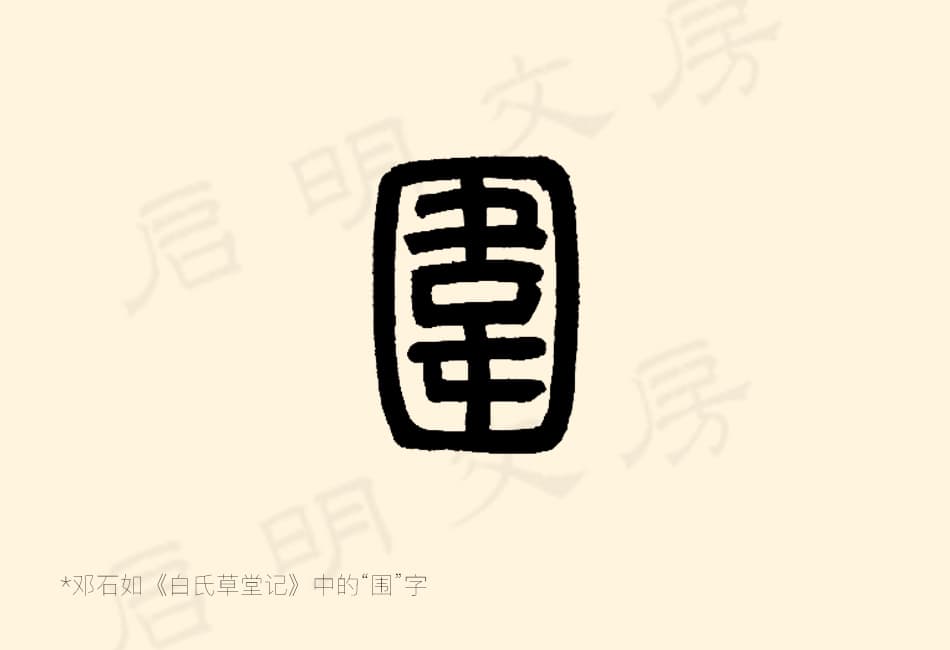
Enclosing frame radicals wrap around the inner components — but the key is that they should enclose without suffocating. There must always be a small visual gap or opening. For fully enclosed characters, the inner strokes should not touch or merge with the outer frame — it should feel enclosed but still breathable. The character “围” (surround/enclose) is a good example: the outer frame is deliberately left with some breathing room.
That wraps up this overview of the key characteristics of seal script from Qi Ming Wen Fang. Some sections could certainly go deeper, and we’ll plan to write more detailed follow-up articles in the future.
If you found this article helpful, please feel free to share it with other friends who are learning seal script!